DESIGN SOURCE MAP
Sections & components
Start with a whole site, a coded component, an editable design file or a visual reference. Then adapt only what fits the actual project.
Interaction previews
Browse the stills or open a live demo to try the interaction.
START BY SOURCE TYPE
Where to find designs
Local means already saved here. Reusable code still needs the right stack and notices. Platform may require that builder or account. Reference-only means study the idea, not copy the site.
COMMON WEBSITE PARTS
Search the component index.
This is a broad practical map, not a claim that web design has a final number of components. Search a name, then use that group’s “Look in” links.
No matching component. Try a broader word or use the website anatomy guide.
Saved library source packs
Ten retained collections, with actual source downloads and applicable terms. Local previews use saved vendor code with small demonstration wrappers. GSAP, Animate.css and Hover.css have their own terms; the remaining seven listed cores are MIT. Published Motion/Bulma packages are retained rather than their larger documentation repositories.
Start with your saved websites.
Yes—we can recreate these layouts with our own content. These are real saved references, not downloadable company templates. Recreate one first, then make it ours.
Product-led · Apple
Study the product-first opening, clear headline hierarchy and generous space.
Open saved study ↗Original website ↗
Colour-led · Stripe
Study the headline, colour-framed composition and clear supporting actions.
Open saved study ↗Original website ↗
Content-led · Spotify
Study the content groups, cards and navigation. This is an app interface, not a storefront template.
Open saved study ↗Original website ↗
Copy a brief, then paste it into our chat. No company source code is copied.
Browse all saved website pictures ↗ · Browse all company studies ↗
Use the layout ideas with our own identity, copy and permitted artwork. Original screenshots remain private study material; a saved company website is not reusable company code.
Shopify & other website templates.
Platform-specific starting points, separate from the company references above. Candidates—not approved designs. None installed; no account or purchase made.
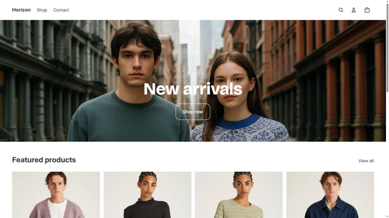
Horizon · Shopify
Free Shopify theme · Needs a Shopify store.
Actual demo captured 16 Oct 2026. Use its theme code only within its Shopify-permitted use; do not paste it into this standalone site or resell it as our own template. Demo media is separate.
Official theme & preview ↗Theme licence ↗Also browse Dawn ↗WordPress & other platforms
WordPress themes need WordPress. Figma templates are design files and may not include a working website. Choose the platform after the project’s editing and shopping needs are clear.
These are source links, not newly inspected visual studies or installed themes. WordPress hosting, plugins and store setup are separate decisions.
Other saved code bases · optional, not our chosen look
The earlier Editorial and Clean Blog examples remain references only. Multiverse was rejected and removed from this shortlist.
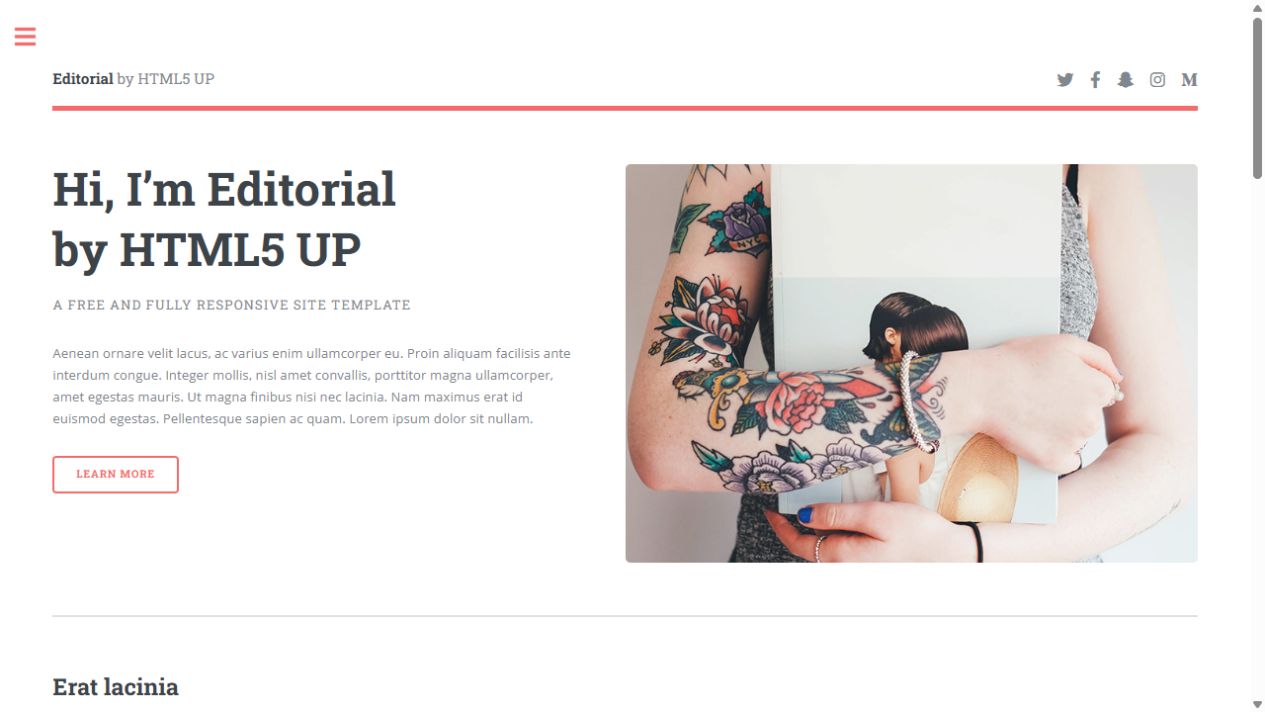
Editorial · HTML5 UP
Static HTML / CSS / JavaScript · Free with attribution.
Study: editorial hierarchy, split hero and sidebar navigation. Keep HTML5 UP design credit under CC BY 3.0. Sample photos need separate checks.
Live demo ↗Official template & download ↗Licence ↗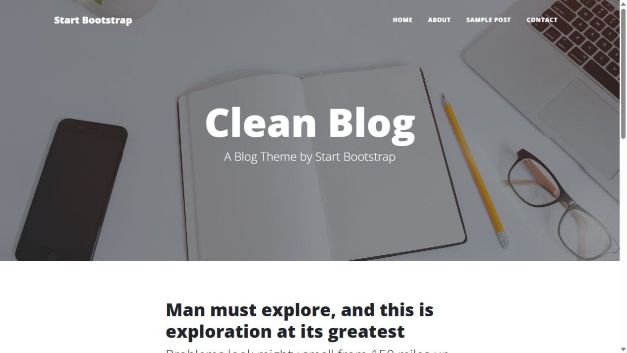
Clean Blog · Start Bootstrap
HTML / Bootstrap 5 · Free MIT code.
Study: large photo-led header and readable post hierarchy. Preserve MIT notices and review older dependencies before use. Contact form needs its own configured delivery service; sample media is separate.
Live demo ↗Source code ↗Licence ↗Saved here means previews, source links and reuse notes—not a downloaded source-code archive. Template code licences do not automatically clear photos, logos or copy. We recreate one reference at a time before combining; no template changes Al Basri or Growly.
Need another platform? Shopify themes ↗, WordPress themes ↗ and Figma design templates ↗ are discovery directories, not selected or installed themes. Figma files are not necessarily working websites.
These libraries’ linked core code licences allow reuse with their required notices. Photos, brand assets, paid templates and add-ons are separate. They are starting points, not automatic approval of the default style. No libraries have been installed here.
Card designs
Open a picture for its unchanged full-size capture, or visit the official demo and code.
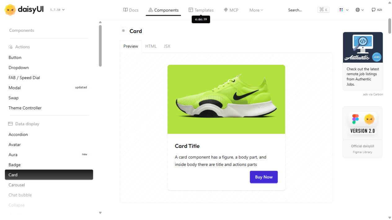
daisyUI
Image, copy and actions; variants include side-image, image-overlay, pricing and selectable cards. Tailwind-based, not a drop-in dependency for our native Design Brain.
Official demos & code ↗MIT licence ↗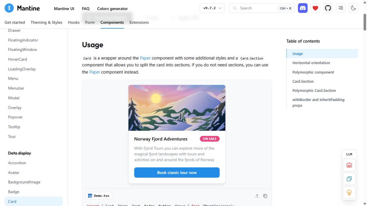
Mantine
Sectioned cards and a wider React component system for forms, menus and dashboards. For a suitable React build, not pasted into this native site.
Official demos & code ↗MIT licence ↗Our working restaurant comparisonPhoto-led, media list, editorial split and type-led menu.All saved card referencesBrand studies, original demos and source captures.Bootstrap cards ↗HTML/CSS framework; varied image, list, border and horizontal arrangements.shadcn/ui cards ↗React source components; customise rather than accepting the default look.
Headers & navigation
The header is the top region. Navigation is the set of links that helps people move around.
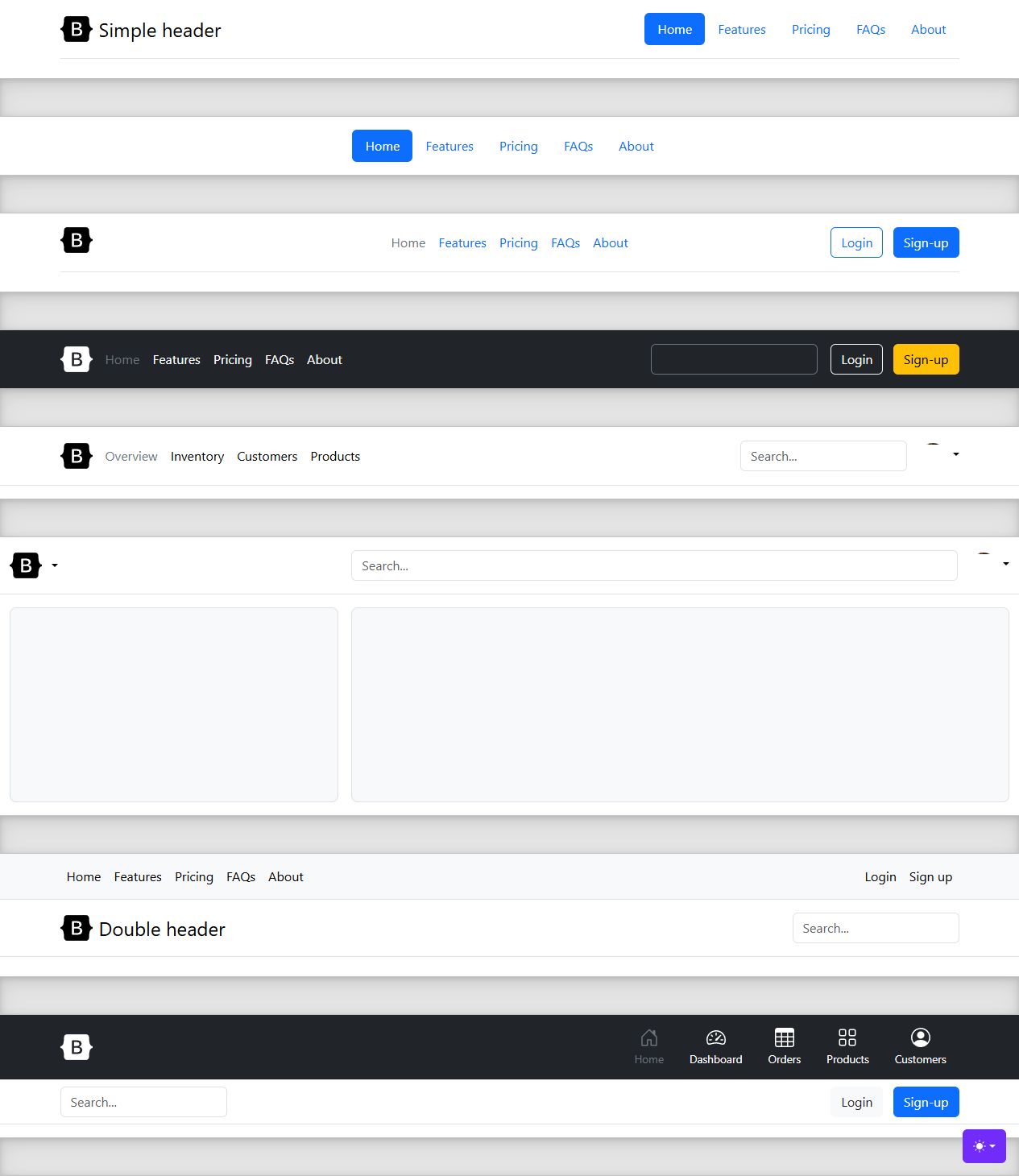
Bootstrap header examples
Actual source examples captured 14 October. CSS/JavaScript framework, MIT code. Static capture, not a complete interaction audit.
Official examples & source ↗MIT licence ↗Forms & enquiries
Form components cover inputs and feedback. They do not automatically send messages, save customers or create a CRM.
Bootstrap forms ↗HTML/CSS input, label, layout and validation patterns.Mantine form handling ↗React form-state and validation utilities.daisyUI inputs ↗Tailwind input styles; validation and delivery must be implemented.Saved form referencesBrowse what is already in our visual library.
Form documentation inspected as a source; no real customer information entered or submitted.
Calendars & booking UI
Different jobs: browse a month, plan a week, or choose an available appointment slot.
FullCalendar demos ↗Month, week, day and agenda candidates. Standard non-premium code is MIT.Standard versus Premium licence ↗Resource timelines and other premium features need a separate licence.Mantine date components ↗React date input/calendar components, not a booking backend.Our saved CRM researchChoosing the system is separate from choosing how it looks.
Footers
The bottom of a page: supporting navigation, contact information and required links.
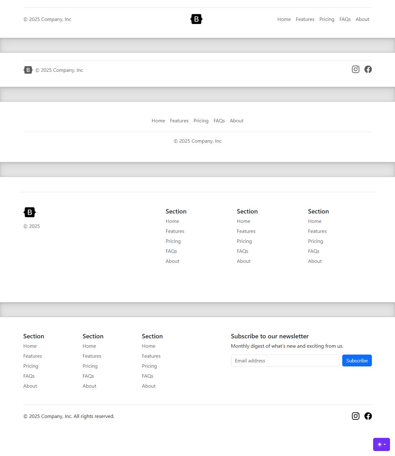
Bootstrap footer examples
Actual source-page capture, not an adaptation. Keep real privacy/contact content; do not invent details.
Official examples & source ↗HyperUI footer alternatives ↗Service websites & workflows
Use components together for a service business. A nice interface is only one part of a working system.
This is a component/source route, not an installed booking service, calendar integration or automated follow-up system. No accounts connected or paid services purchased.
Sources checked 14 October 2026. The daisyUI/Mantine card and Bootstrap header/footer renders were visually inspected; other catalogue links are not claims that every demo was tested. Full-context images are preserved, not upscaled. Core code licences do not clear all sample media. Pico CSS was excluded from new-project recommendations because its official documentation now states it is unmaintained.