Section
What part of the page does: hero, services, menu, FAQ or footer.
Find definitions and examples for website sections, layouts and styles.
What part of the page does: hero, services, menu, FAQ or footer.
A reusable building block: button, card, form field, tab or dialog.
How content is arranged: split-screen, bento, editorial grid or full-bleed.
The overall character: editorial, cinematic, Swiss, playful or luxury.
How panels look: flat, outlined, glass, grain, gradient or hard shadow.
How it behaves: accordion, tabs, reveal, sticky section or carousel.
Example: “Editorial” is not a page section. A restaurant homepage can use an editorial art direction, a split-screen hero, a card-grid menu and an accordion FAQ.
Header → Hero → Trust → Services → Process → Testimonials → FAQ → Contact → Footer
Header → Hero → Menu highlights → Story → Gallery → Location & hours → Booking/action → Footer
Masthead → Lead story → Article grid → Topic sections → Newsletter → About → Footer
Hero → Selected work → Project stories → Services → About → Contact → Footer
Header → Product hero → Benefits → Gallery → Specifications → Reviews → FAQ → Purchase action
Showing the full guide.
A short strip above the header for one timely message. Keep it dismissible when it covers content.
Also: promo bar, alert bar, top bar
Brand identity and the main routes through the site. It may be static, sticky, transparent or include a mega menu.
Open a saved navigation example →The first major section: headline, supporting message, main action and often a defining image.
Open the centred hero →Real evidence that reduces uncertainty: client logos, verified ratings, credentials, press or measured results.
Never invent reviews, counts or awards.
Logo row examples ↗A scannable explanation of what is offered. Features describe what it has; benefits describe why that matters.
Compare saved layouts →Feature grid examples ↗Business origin, people, method or point of view. Often uses an editorial split of image and longer copy.
Open full-template examples →Repeated items with enough information to compare. Cards, compact lists and typographic menus are different patterns.
Try four menu structures →A visual collection for atmosphere, work or products. Use a grid, masonry layout, carousel or lightbox only when it helps browsing.
A short sequence that explains what happens next. Numbered steps are usually clearer than decorative diagrams.
Customer evidence or a project story. A case study explains problem, decisions and outcome; a testimonial is a quotation.
Testimonial examples ↗Packages, inclusions and trade-offs. Highlight differences without hiding conditions or inventing scarcity.
Pricing examples ↗Answers recurring questions. An accordion is the interaction pattern; FAQ is the content section.
Open a working accordion →A focused invitation to take the next step, usually near the end. One primary action is stronger than several equal buttons.
Open the flat CTA →The practical information needed to visit or enquire: address, map link, opening times, phone and form.
Browse form sources →The closing navigation and practical links. It can be compact or become a large final call to action.
Open the CTA footer →Element means a basic piece such as text, image or icon. A component combines elements into a reusable unit. A section is a larger page region. A pattern describes how parts are arranged or behave.
A control that performs an action, such as submit, save, open or play. Its label should describe the action.
Text or an image that takes someone to another page, place or resource. A link navigates; a button performs an action.
A visually grouped unit containing related information, often an image, title, detail and action. It is a container, not automatically a button.
The wording and control that asks for the next step, such as Book a table or Request a quote. A CTA can be a button, link or whole section.
A set of routes that helps people move through a site or product. Navigation is the system; a menu is one way to present it.
A group of labelled controls used to enter and submit information, such as an enquiry, booking or sign-up.
One place inside a form where someone enters or chooses a value. A visible label should explain what belongs there.
A control that reveals a list of choices. Use it when the options are known and showing them all would take too much space.
A checkbox allows independent choices; radio buttons choose one from a visible group; a switch changes an immediate on/off setting.
A compact label for status, category or a small removable choice. It should not compete with the main heading or action.
Controls that switch between related panels without leaving the page. The active tab and its panel must be clear.
A labelled control that expands and collapses related detail. FAQ is content; accordion is the interaction.
A focused layer shown over the page for a short task or decision. It needs a clear close route and keyboard focus handling.
A short explanation attached to a control, usually on hover or keyboard focus. It should not hide essential information from touch users.
A brief status message after an event, such as Saved. Important errors need persistent guidance rather than a disappearing message.
A trail showing where the current page sits in a hierarchy, such as Home / Services / Web design.
Controls that divide a long collection into pages and provide next, previous or numbered routes.
Information arranged in labelled rows and columns for comparison. A data table may add sorting, filtering and selection.
A side region for navigation, filters or supporting tools. A drawer usually slides over or beside the main content.
Heading, copy and action aligned around one central axis. Clear and calm; easy to overuse.
Text and media share the width. Useful for heroes, stories and product explanations.
Media or colour reaches the viewport edges. Strong atmosphere, but text still needs a readable container.
Equal repeated units for comparable items. Best when each card has a consistent information job.
Different-sized modules in one grid. Good for varied highlights; poor when every card fights for attention.
A dominant lead item, supporting stories, strong type hierarchy and intentional image crops.
Elements deliberately offset from a strict grid. Adds energy, but the reading order must remain clear.
Columns of varied-height items. Useful for image collections; weaker for content that must compare row by row.
Image and text switch sides down the page. Familiar and readable, but repetitive without hierarchy changes.
One panel stays visible while nearby content changes. Use only when the sequence genuinely explains something.
Art direction combines typography, imagery, colour, composition and motion. A label is a starting point, not a complete design.
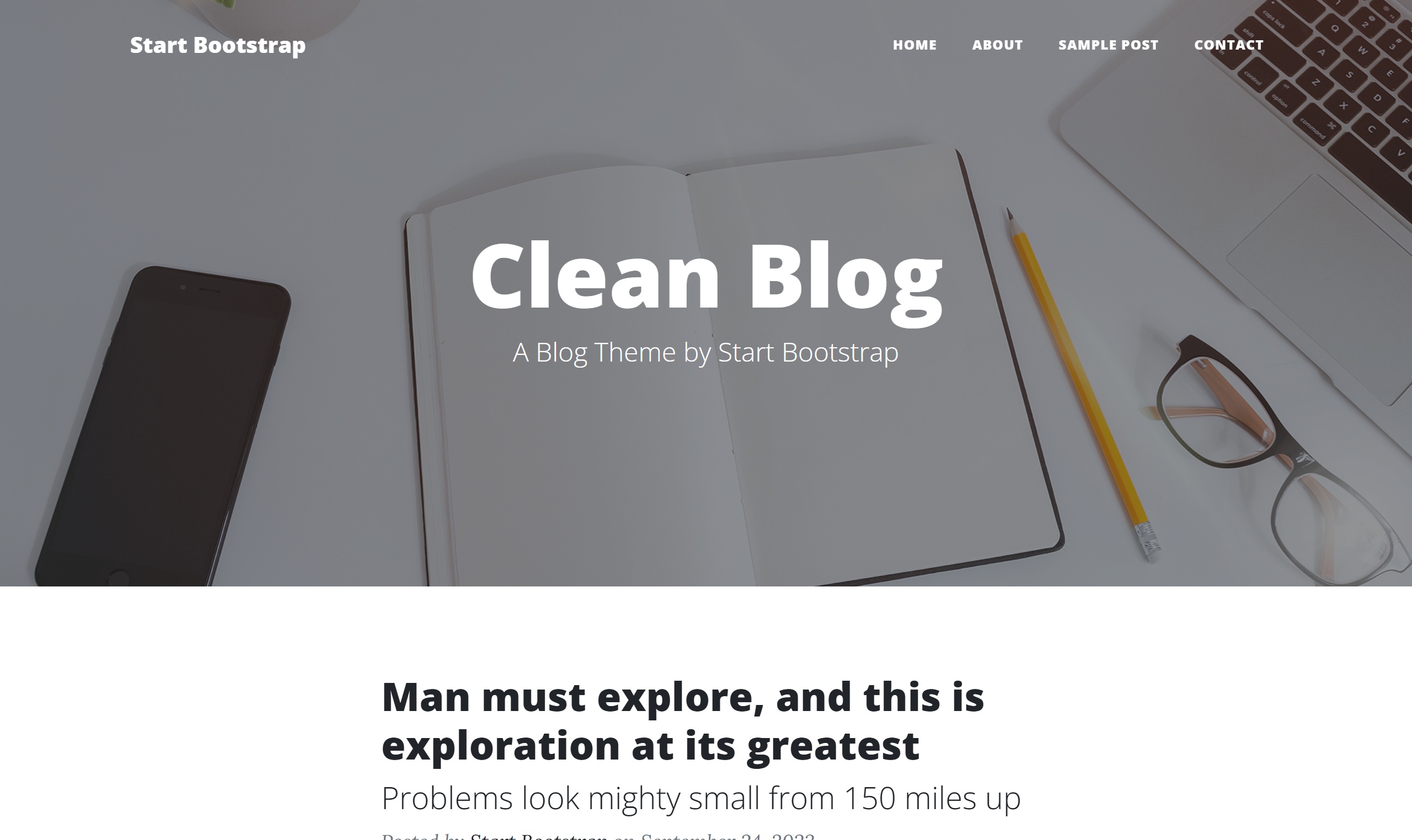 Clean Blog preview ↗
Content-led hierarchy, expressive serif/sans pairing, strong crops, captions and varied column rhythm.
Good for: restaurants with stories, publications, portfolios and cultural brands.
Strict grid, clear alignment, sans-serif type, white space and restrained graphic colour.
Good for: studios, architecture, information-heavy services.
Few elements, generous space and controlled contrast. Simplicity depends on excellent type and imagery.
Good for: premium products, portfolios and focused services.
Raw structure, stark contrast, exposed borders and intentionally unpolished web language.
Good for: experimental culture, campaigns and bold portfolios.
Chunky borders, flat bright colour, hard shadows and oversized friendly type.
Good for: youth brands, tools and playful services.
Restrained palette, refined display type, slow rhythm and carefully art-directed photography.
Good for: hospitality, fashion, dining and high-value services.
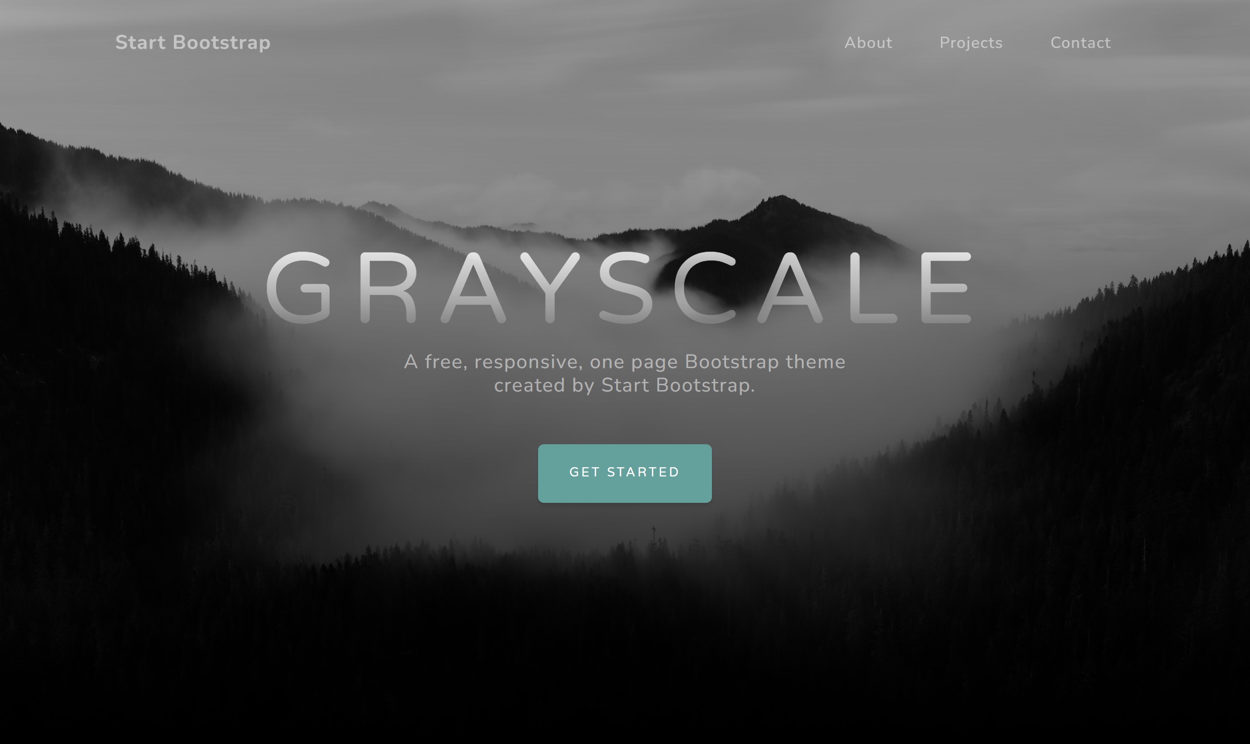 Grayscale preview ↗
Full-bleed imagery, dramatic scale, dark surfaces and paced reveals. Performance and readable overlays matter.
Good for: entertainment, destinations, restaurants and launches.
Warm materials, irregular shapes, natural colour, tactile texture and human-made details.
Good for: food, wellness, craft and community businesses.
Period-inspired type, colour and illustration. Reference one era deliberately instead of mixing every nostalgic cue.
Good for: cafés, music, events and personality-led brands.
Layered imagery, pattern, saturated colour and expressive typography held together by a strong hierarchy.
Good for: fashion, music, festivals and bold campaigns.
Predictable grid, restrained palette, clear services and credible proof. Professional does not have to mean generic.
Good for: finance, legal, B2B and established services.
Dark or technical surfaces, precise grids, luminous accents and data-like details. Glow is optional, not the definition.
Good for: software, gaming, AI and advanced products.
Rounded forms, characterful type, illustration and bright accents with obvious, touchable controls.
Good for: family services, education and community tools.
Solid colour, clear type and little simulated depth.
Structure is defined with borders instead of shadows.
Subtle shadows separate layers without looking like floating stickers.
A crisp offset shadow used as a graphic device.
Translucent panels with background blur. Contrast must be checked over changing media.
A colour transition used for depth, emphasis or atmosphere.
A subtle texture that reduces digital flatness. Keep files and contrast under control.
An image reduced to two dominant colours for a controlled identity.
Layered photographs, shapes and type with deliberate overlap.
Visual feedback when a pointer rests on a control. Essential actions still need touch and keyboard access.
The visible keyboard position. It is not the same as hover.
A heading reveals related content. Useful for optional detail, not for hiding every important fact.
Switch between related content panels without leaving the page.
A sequence shown one or a few items at a time. It needs controls, keyboard access and a reason to exist.
An element stays visible while nearby content scrolls.
Content becomes visible as the page loads or scrolls. The final state must remain readable without motion.
Layers move at different rates to suggest depth. Use sparingly and disable it for reduced motion.
Continuously moving text or logos. Provide a static readable alternative and pause when appropriate.
A small response to one action: a toggle state, saved confirmation or icon change.
A focused layer over the page. It needs an obvious close route, focus management and Escape support.
A large navigation panel grouping many destinations. Useful only when the information architecture needs it.
Open the animation shelf for working examples. A screenshot can show an appearance, but it cannot prove motion, responsiveness or keyboard behaviour.
Pick one real example for each important job—hero, menu, story, action and footer. Do not combine five unrelated visual systems just because every part looks good alone.
This guide uses original teaching diagrams and links to the existing private Design Brain library. The roti canai photograph is by Misaochan (CC BY-SA 3.0); photo credit and licence. Template code, fonts, icons and bundled media keep their own source terms. No ordering, enquiry submission, purchase or publication was added.